The Power of Color in Graphic Design
"The Power of Color in Graphic Design" is all about how different colors can affect how we feel and think when we look at a design. Just like how different colors make you feel different emotions, the same thing happens when you see designs with different colors.
For example, imagine you see a poster for a horror movie. It's mostly black with some red splatters on it. The dark colors and red might make you feel a little scared or uneasy. Now, imagine you see a poster for a comedy movie. It's mostly yellow and blue and has a cartoon character on it. The bright colors and cartoon might make you feel happy and excited.
That's how color can change the way we feel about a design. Graphic designers use color on purpose to create certain emotions and feelings in their designs to make them more effective.
Another example, a fast food chain's logo is mostly red and yellow, these colors often associated with hunger and appetite. On the other hand, a spa's logo is mostly blue and green, these colors are often associated with calmness and relaxation. So, you see how color plays an important role in graphic design, it's not just about making something look pretty but also about creating a certain message and feeling for the audience.
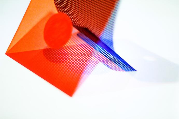
Colors can have a big impact on how we perceive and interact with designs. Different colors can evoke different emotions and feelings, and graphic designers use this to their advantage when creating designs. For example, warm colors like red, orange, and yellow are often associated with emotions like passion, excitement, and warmth. These colors are often used in designs related to food, entertainment, and sports.
On the other hand, cool colors like blue, green, and purple are often associated with emotions like calmness, trust, and professionalism. These colors are often used in designs related to health, finance, and technology. Black and white are also important colors in graphic design. Black is often used to create a sense of sophistication, elegance, and mystery. White is often used to create a sense of purity, simplicity, and innocence.
In addition to evoking emotions, colors can also be used to create contrast, hierarchy, and visual interest in a design. For example, using a bright color as an accent can draw attention to a specific element in a design, while using a neutral color as a background can create a sense of balance and harmony. Overall, the use of color in graphic design is a carefully considered and strategic choice, it's not just about aesthetics but also the ability to create a certain message and feeling for the audience.